


Gantt Chart
What is a Gantt chart?

A Gantt chart is a project management tool that allows you to effectively identify and keep track of any task to complete on a particular project. For example, the chart will enable you to track progress and interdependencies between tasks, delegate tasks, allocate resources efficiently, meet deadlines, and assign people responsible for tasks.
A Gantt chart has many names, such as a Gantt chart, Gantt ribbon chart, or calendar graphic. In practice, a Gantt chart looks like a popular bar chart that illustrates a business plan or timetable. Its creator is Henry Laurence Gantt, an American mechanical engineer and management consultant. They use a network diagram to define the project's various tasks in chronological order using relationships.
A simple definition of a Gantt bar chart enables project managers and team members to visually track all stages of work and effectively set a task calendar. That, in turn, means increased productivity and team results.
What do you need the Gantt chart for?
The main purpose of the Gantt chart is to visualise information in a diagram so that it is easier to track results and progress through the project stages. It is essentially a working tool for self-monitoring, prioritising and streamlining business processes to help the team maintain momentum and move smoothly towards the goal.
It is also worth considering that the network model (network graph), also actively used in project management, differs from the Gantt chart. The network model allows you to control absolutely any work tasks within the project, while the Gantt chart is designed only for the tasks needed for successful completion and launch.
Gantt charts: advantages and disadvantages

The Gantt chart:
- Reflects the process of project implementation, which facilitates the work and self-monitoring of the team;
- Allows you to control the stages and timing of tasks;
- Helps track and evaluate progress;
- Simplifies the interaction between team members;
Effectively distributes the workload and motivates the achievement of the goal (by visualising progress).
However, one can also list the following disadvantages of the Gantt chart, which include:
- Using a Gantt chart requires regular data updates. Usually, you develop the chart in the initial planning stages. Nevertheless, the project may change later on, and therefore the chart will need to be updated accordingly. You will have to revise tasks, resources, responsibilities and milestones!
- If the diagram gets drawn incorrectly, the graph can distort what is happening. Also, you cannot use all the tools to create a Gantt chart to display the necessary resources, making the picture for the team incomplete.
- Creating and setting up a chart takes a lot of time. Additionally, it is quite time-consuming to work with, so the manager will need to regularly allocate extra time to the diagram to avoid confusing tasks and deadlines.
Task planning using the Gantt Chart
Task planning using the Gantt Chart is the use of the chart as a flexible tool for setting and formulating tasks, as it helps to answer the most important questions in planning:
- What tasks need to be completed, and at what stage?
- When does the project start, and by when should it be completed?
- When should a particular task be started, and when should it be finished?
- Which tasks overlap with each other? How are they related?
- Which tasks should be delegated and to whom? Who is in charge?
The answers to all these questions are used and displayed in the chart. All team members can keep track of the tasks and monitor their progress. Additionally, the project timeline in the form of a Gantt chart is taken into account when assigning and setting tasks, which can optimise team and manager time management.
Gantt chart in project management

Gantt chart in project management is particularly important to project managers. These people are directly responsible for working on each project, providing control over the work processes, and therefore need to be aware of all the specialists' work and task resolution.
The Gantt ribbon diagram comes in handy in the following ways:
- Managers and business owners can use the chart information to better monitor the work of the team, identify weaknesses in the processes and work of employees, minimise resource costs, etc.;
- With the help of the diagram, it is much easier for team members to assess the contribution of each member to work and limit their area of responsibility, which, in turn, helps avoid unnecessary conflicts, miscommunication and irrational overlapping of tasks;
- Access to the Gantt chart maintained by the team will provide the customer with clear information on the work status, deadline, and cost-effectiveness of their investment.
Gantt chart in lean manufacturing
Lean manufacturing is an approach to management that focuses on producing only those goods that best satisfy customers. Lean production minimises scrap, defects, the number of resources, space, and time spent. Thus, the Gantt chart in lean manufacturing is one of the most flexible and convenient tools for optimising and controlling this production. In addition, it can monitor emerging defects and find weaknesses in business processes to eliminate them quickly and efficiently.
How to build a Gantt chart

The Gantt chart for a project plays the role of a leading and regulating tool, so there is a myriad of ways and software to build it. So, how do you make a Gantt chart in practice? You can even do it with plain paper and a pen, but the best way is to go to a special platform designed to use such tools. We recommend watching training videos or taking the appropriate course to learn how to make a complete Gantt chart.
The following summarises the most basic types of software that can make Gantt charts.
Gantt Chart in Excel
Creating Gantt charts in Excel is not as straightforward as creating Gantt charts using platforms designed specifically for this purpose. However, Microsoft Excel is one of the most affordable (financially and functionally) tools, so it cannot be written off. It takes at least 30 minutes to build a diagram in Excel, and there are no additional parameters (e.g. dependencies between processes).
Steps to build a Gantt chart in Excel:
- Create a range of data. To do this, list in a column all the required tasks, and in front of that, list the start date and the end date (or the number of days to complete each task). You can transfer the data from Microsoft Word or any other software that has an integration function with Excel.
- Capture the data range you have created. Next, go to the top Insert tab and select a line chart with accumulation.
- To make your Gantt сhart start with the task you entered first, change the task order. To do this, click on the task axis and select 'Reverse Category Order'.
- Click the Format tab and select 'No Fill' if you want to format the chart. You can also name the chart and its axes and change the colour.
To speed up and simplify your job, you can also download a free Gantt chart template in Excel from the official Microsoft website.
Gantt chart in Google Sheets
Google Sheets are best for small charts with a maximum of seven to eight people involved. It's a free and intuitive online tool, so it takes a minimum of time to create a diagram. Here's how to build the chart in Google:
- Create a table and enter all the necessary information you want to account for in the chart.
- In the free cells to the right of the table, place the project dates.
- Highlight the empty area between the data and the dates with your cursor - this is where the chart will appear.
- Click the Format tab and select 'Conditional Formatting'.
- Select 'Add Rule' followed by 'Your Formula' in the window that appears.
- Type the following into the box: = AND(E$1<=$C2; E$1>=$B2), where E1 is the first cell in the row, C2 is the end date of the first task, and B2 is the start date.
Gantt chart in MS Project
The programme MS Project is Microsoft's data visualisation software, so it is even easier to create a Gantt chart than in Excel, and it is automatic. So here is the first thing you need to do after installing the software:
- Open the File menu and select Options, then Customise Ribbon.
- To make a Gantt chart, you must add the MS Project chart wizard function. To do this, select the section that is most convenient for you, such as Format, and click the group creation button.
- Go to the Ribbon Setup tab and open the option for commands that are not in the ribbon.
- Scroll to the end of the list that opens and find the MS Project Gantt Chart Wizard section. Then click the "Add" button. This section will automatically appear in the previously selected tab (e.g. Format).
After that, you can proceed directly to creating diagrams. To do this, perform the following step by step:
- Open the Diagram Wizard tab.
- Go to the tab with the list of tasks. You can enter new steps here or edit them using the context menu. Additionally, there is a window where you can enter the necessary information, such as task title, due date, total duration, etc.
- In the Predecessors tab, you can specify links to other tasks previously completed in MS Project. That will allow you to track interdependencies and create a full-scale chart.
- Once you have finished entering all the tasks individually, click OK. A timeline will appear on the right-hand side of the window, showing the sequence of tasks you have generated.
Gantt chart in PowerPoint
PowerPoint has fairly straightforward functionality, so it is well suited to creating a Gantt chart in just a few steps:
- Select the "Create" tab in the left-hand panel, opening PowerPoint.
- In the template search box, type "Gantt chart" and press "OK" or the key labelled Enter.
- The search results will give you five standard Gantt chart templates. Select the template that best suits your project timeline and requirements. Click "Create."
- Edit the content of the template by entering your data. By default, you can edit tasks and deadlines here. To do this, click on the desired field and fill it in.
- The project start and end dates are in the upper left and lower right corners of the Gantt chart. You can also edit them and enter your data by clicking on the dates.
- To adjust the length (duration of the task), click on the taskbar and then drag it to set the desired time scale. You can also put your start or stop markers by clicking and dragging them to your desired position.
Gantt chart in Trello
The Trello website offers many ready-made Gantt Chart templates, where you only have to enter your information following the sample to start project management. That makes Trello one of the most user-friendly programmes, and it is best suited for people new to project management or managers who are short on time. All information is visually displayed here (from deadlines to comments that employees can leave on tasks when they share the diagram). Additionally, the graph itself is fully automated and does most monotonous work. Trello's helpdesk is also available 24/7 and is always ready to explain how to do your diagram.
Gantt chart in Jira
Jira Roadmap is an application designed specifically for project management and implementation. Build the Gantt chart with the help of so-called "epics" and stories with each illustrated task. This application is best suited for large graphs, for example, for projects that will last a year or at least a quarter. It is better to look at other software for day-to-day charting or detailed project planning. The Jira diagram requires special training to work with it.
Gantt chart in Notion
Notion is relatively new software and a much more functional and extensive database than the Gantt chart. It makes it easy to scale projects, adjust deadlines and monitor the work of several teams at once by arranging projects and tasks in chronological order. You can also use Notion to display workloads and problems that can pop up. However, creating a diagram in Notion requires separate training due to the complexity and number of tools, just like Jira.
Gantt chart in Power BI
Power BI is a comprehensive business intelligence software developed by Microsoft that combines several software products that allow for technological and visual design by integrating different tools and data. Power BI belongs to the self-service class, i.e. it is a fully self-sufficient and autonomous software that the client can use for many other purposes at once. Here you can display the hierarchical structure of the project, build relationships between tasks, add columns and indicators, and monitor many tasks (up to several thousand) at once. However, constructing a Gantt chart in Power BI also requires special knowledge.
Examples of Gantt charts
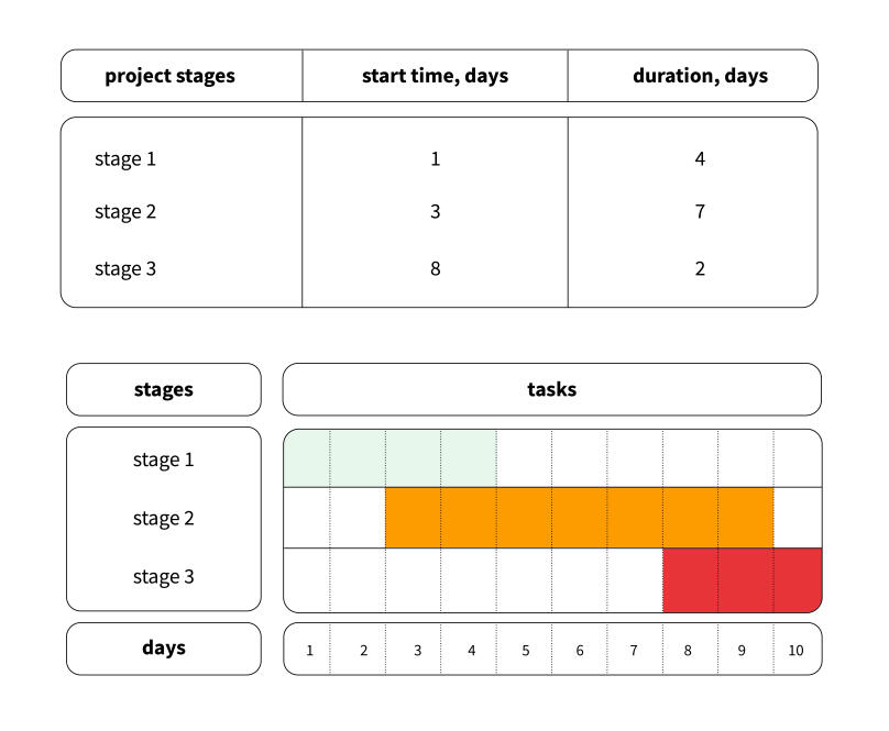
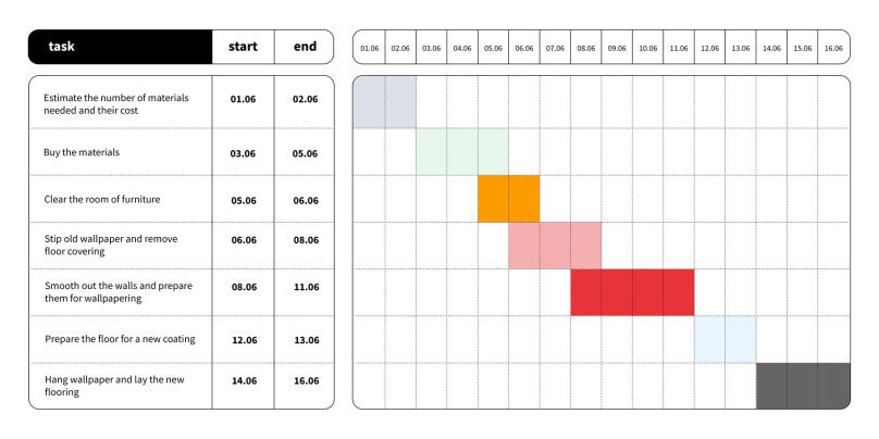
In the classic example, the horizontal axis of the Gantt chart is the chronological order of the tasks you need to finish before you complete the project. On the horizontal axis of the Gantt chart is the timescale that measures the duration of each task and the whole project. Next to each task, you can also see the practitioners responsible for it. Here is what a classic Gantt chart looks like in practice:
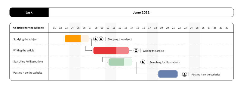
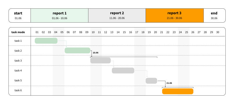
Another type of diagram involves the use of critical paths and baselines, in addition to tasks and deadlines. For instance, a product delivery time or release date is given, which extends the diagram's structure. Here is an example of a Gantt chart of this type: