How to make millions by selling through landing pages
Would you like to become an online sales guru? Well, start selling through landing pages, which are single-page websites.
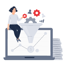
Landing pages will highlight your product and show it in all its glory. In traditional marketing textbooks, landing pages are considered the decisive point of the sales funnel. A potential customer goes through when reading the text on the landing page. However, these days a landing page can also be used as a traditional sales tool and as a supplement to the website. It describes the benefits of the product, particularly for an audience who are already "warmed up" and ready to buy, or is used to measure the target audience's interest in a product.
Are you uncertain whether you will be able to start a business and make it pay for itself? Try to develop a landing page, and at the same time, you will get some sales training. In the following article, we will discuss what a product landing page comprises and how you can utilize it as a tool to gauge customer interest. Suppose that you do not have a huge budget for creating a landing page, although you want to find out how much your idea could pay for itself.
Step 1. Defining the target action
A target action is what a user should preferably do when visiting your landing page. Most commonly, the target action is making a purchase. The page has the "Buy," "Get," "Choose," and "Purchase" buttons with a payment form. The formula for success is a smooth and quick transition to the payment that requires no additional actions on the user's part. Another option for targeted action is accepting the order, which is a step toward communicating with the seller. The final option, which is quite exciting, is the collection of contacts. You can do that without actually selling the product, just with a promise to sell it to the first several visitors. You can also offer free content in exchange for their contact details.
Without targeted action, you will be unable to create a landing page that is as relevant as possible to the ultimate aims of a business. So, how do you choose this action? Creating a landing page to collect data is best if you are just beginning with landing page sales. On the other hand, if you already have experience in sales and plan to turn your landing page into a sales page straight after testing it, then set the goal of warming up the audience for future purchases. To do that, change the button from "Learn more" to "Contact a specialist" or "Reserve your spot."
Step 2. Studying your competitors
Consider which of their tools you can use and modify for yourself. Competitor analysis is vital, and without it, you will probably be unlikely to understand the building blocks your landing page needs, how you can influence different segments of potential customers, and which trigger phrases are best to avoid. It can also help you stand out from your closest competitors by allowing you to transform your unique selling proposition.
How do you study competitors? Check the following parameters:
- The availability of products similar to yours (substitute products)
- Characteristics of such products
- Advantages and disadvantages of their products
- Marketing strategies for their products
- The tools used to market these products
We discuss the study of competitors, applying their techniques in your project's work, and the successful start of a business in our Lectera courses aimed at entrepreneurs. You will learn all the skills quickly, and we will help you practice them using real case studies. After completing a course, you will be able to use your newly acquired knowledge in real life and business. See the link for more information about our courses.
Step 3. Creating your landing page text
A landing page has a convenient structure (which we will discuss later) that includes marketing text. It comprises specific blocks that enable you to move a potential customer towards buying a product.
The text of a landing page always includes points that cover the target audience's problems. For example, suppose you sell exclusive perfumes. One of your potential customer's pain could be the desire to be remembered by their fragrance, attract interest from others, and feel confident. If, for example, you sell tires, the pain will be quality and cost. Your pricing policy is something you could continuously play around with since it is significant in most cases.
In addition to finding solutions to the "problem" (for example, promising to sell an inexpensive and high-quality product), you must reveal your offer on the landing page. This unique selling point differentiates your product from all your competitors. After it, we recommend you briefly reveal the limited nature of the offer: "Exclusive French perfumes. Get a 50% discount if you buy within five hours."
Then, you can indicate both the product's benefits and customer reviews. If necessary, share the process behind creating the product (or providing a service) and discuss the people who offer these services. For example, you plan to sell something exclusive and unique, a one-off item for every customer, very expensive, or with huge competition. In this case, it is better to discuss the process of creating the product or service. If you want a potential consumer to trust you, introduce them to your team. This model of personal contact will increase their interest in the product.
At the end of the landing page, it is imperative to deal with possible objections: "it is expensive," "you have to pay for a delivery," "competitors are better," etc. Then, at the same time, answer the most frequent questions: how long it takes to deliver the goods, where and how you can pick them up, and how to issue a return.
Lectera’s Online Courses by topic
How do you ensure the text is suitable for the landing page?
- It is brief. You have to sell a product (or collect contacts and assess the possibility of selling it), not write a book.
- It is easy to understand. If something requires additional explanation must be explained. There should be no words or phrases that only a tiny circle of people could understand.
- It is simple. You have shortened sentences and abandoned complex structures.
- It is broken up by subheadings. It does not look like a "block": it is easy to navigate, and the meanings of each section correspond to the title.
- It does not scream at the reader and does not promise them mountains of gold either. Instead, you utilize a clear point of view, and when you read the text, you believe it yourself.
How big does a landing page have to be?
It all depends on your objectives. If you want the user to buy a product, then be prepared to discuss its benefits. You can create a shorter page to gather contact details for a mailing list or evaluate product demand. Is your product expensive? Then, you will need a more extended landing page. Is the audience "cold," that is, they are unlikely to be familiar with the product and are not "warmed up" yet to buy (they do not realize their pain or do not see it as one)? Then you will need a more extended landing page! It is best to choose a shorter landing page in other situations.
Step 4. Designing a landing page prototype
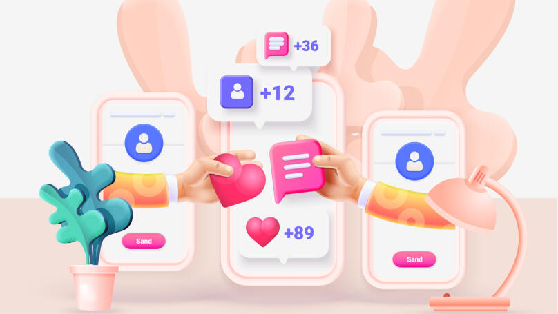
A prototype is a landing page plan that is not yet "overrun" with additional designs. It schematically illustrates what should be on the page and where it will be positioned, including buttons that lead to features and where pictures and colors are best placed to attract attention. More often, prototypes are created in Figma and Canva.
The core elements of a landing page prototype aimed at collecting contacts or discovering the extent of demand are:
- The cover (which includes a bright, understated image, frequently a solution to the "problem" or a promise of a dream coming true when buying the product), landing title, landing subheader, and the "Buy" or "Go-to" buttons leading to the following blocks.
- Sections found on the final landing page, with the headings: "FAQ", "Benefits," "Closing objections," and similar.
- Filling in sections with text and images. Images are sometimes more critical than text-based content. They allow you to convey the feeling that a customer will experience after making a purchase. If you have the opportunity to create an infographic, definitely do it! Users recognize an offer better if it is visually apparent.
- Call-to-action buttons. If it is long, have at least three for the entire page. If it is short, use two. But do not put 10 or 15 of them because that number of requests to leave contact details will irritate any user, no matter how loyal they are to you. So, instead, you can place a call-to-action button in the header and pin it on the landing page. This way, the user will be able to click on the button and perform the action you want them to make whenever they want.
Step 5. Creating your landing page
If you have a chance to determine whether the prototype is suitable for your target audience and if your structure meets their pain, be sure to do it. You can achieve this with a designer who is also responsible for UX, a prototype specialist (most often a marketer who knows how to write texts), and an analyst who understands the characteristics of your audience. If you have no opportunity to do this, simply prepare several versions of the prototype. Each version should contain different calls to action, focus on other issues, etc. Most commonly, marketers test several landing page options with target audiences and then choose the most suitable one for attracting the attention of the vast majority of potential buyers.
Once the final landing page prototype version (or numerous versions) is completed and ready, use free or shareware website builders. The most popular is, of course, Tilda. However, you will have to pay for advanced features necessary in about 50% of cases. Prices start from ten dollars per month. We should also mention ReadyMag, Nethouse, and Wix, among the most frequently used website builders. They are either free or offer limited features that require no payment.
What if I hire a designer who will create a landing page for me?
It will certainly be more expensive than doing it yourself. There are plenty of tutorials on the Web to help you cope with designing something from scratch, and it just takes an evening to complete. Why spend extra money if you do not need a unique and thorough design when you are only at the stage of discovering the level of audience interest? Perhaps, while creating your landing page, you will discover your inner designer! Just do not use more than two colors or fonts in your design. Add features only if they are needed, make sure that the pictures you choose are in the same style, and try to leave plenty of space between your landing page elements. Do not take all your photos from photo stock with ridiculously caricatured pictures: it is better to draw something yourself rather than fail to convince a potential buyer.
Step 6. Assessing whether the final result meets expectations

You should understand what your landing page visitor wants to do: discover more about your product or share their contact details and what they want in return. There are several test options:
- Customer Development "at the bare minimum." You can conduct sessions (in person or via video apps) with users representing your target audience to understand how their experience of interacting with the landing page meets your expectations. This is the best approach, although it takes time, effort, and (sometimes) money.
- Polls and surveys. Created in online toolkits like Google Forms, you can send them out with your landing page and a request to rate your landing page prototype. In this case, you cannot always guarantee that those who responded to the survey will match your target audience.
- Personal opinion. If you are confident that you can look at your landing page objectively and see what should be changed, try limiting yourself to this kind of research. However, it will not be enough if you decide to sell actual products and not just evaluate the audience's interest.
Finally, we can discuss what you need to check before launching your landing page.
First, it might seem tedious, but you have to think about the load performance. Some marketers completely forget about this, and the user may leave your page if it takes longer than three seconds to load. Go to Google PageSpeed Insights to determine how fast your landing page takes to load. Second, review how your landing page looks on mobile devices and tablets. This can be adjusted when creating a page based on a builder. Third, to follow an interest in a product, you have to link analytics systems to the landing page (for example, Google Analytics) to explore audience flow. Well, that's it! We recommend you assess interest in the product for at least two weeks and utilize promotional tools like targeted and contextual advertising. They do not cost much but will bring you an audience with a bang.
Share this with your friends via:
Latest News

In Illinois, starting from the 2026–2027 academic year, all public high schools are required to include instruction on climate change in the curriculum.

At Okemos Montessori Elementary School (Michigan, USA), students marked the birthday of the school dog Sadie with a charity drive for an animal shelter.

In India, the National Council of Educational Research and Training (NCERT) launched the e-Magic Box app with AI bots for early learning of children ages 3–8.

In the UK, £23 million has been allocated for the expansion of the EdTech Testbed program — pilots of educational technologies in schools and colleges.

In the US, Tuskegee University announced the launch of Tuskegee University Global Campus (TUGC) — a new online platform for distance learning.





 Test. Is It Time for You to Take a Vacation?
 Test: Your Historical Mentor: Who Will Help You Unlock Your Potential?
 Test. Where does your energy leak away on weekdays?
 Test: What spring upgrade does your career need?
 Test. What Kind of Medieval Cat Are You?
 Test: What’s Your Attachment Style?
